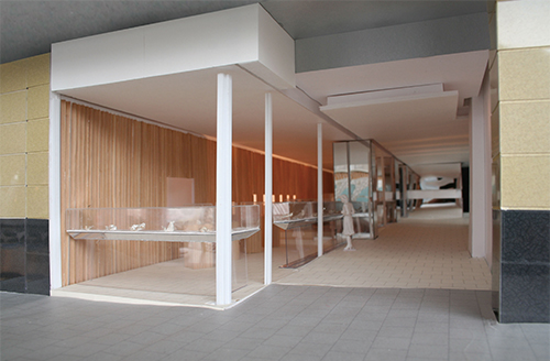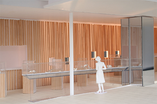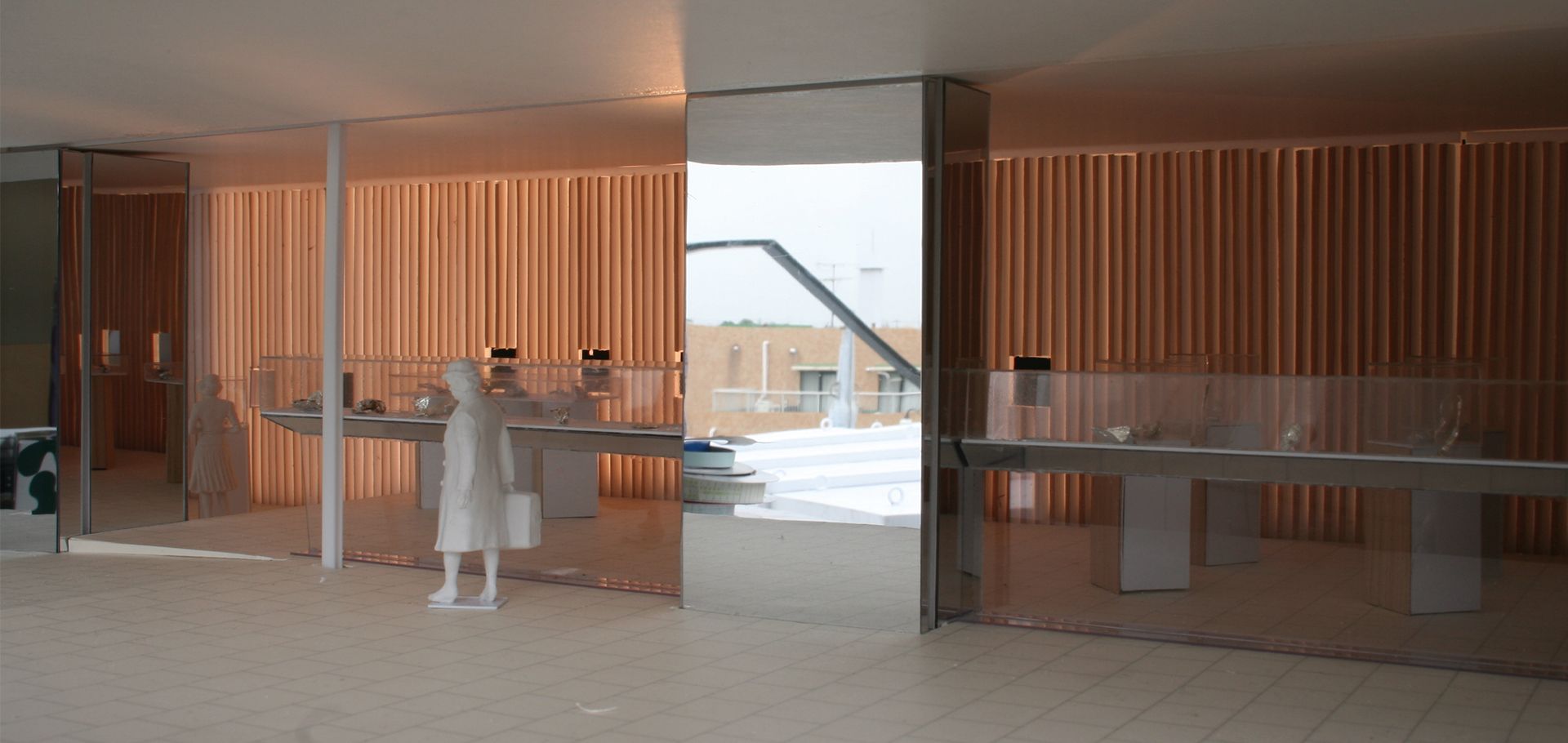

Branding is a very important issue for the brand companies. To emphasize their brand, one brand company uses the same design for all of the stores throughout the world. We began designing with the thought to follow the impression of Georg Jensen stores which is based on a tradition lasting more than 100 years. From our store visit in Sydney, Copenhagen, and Los Angeles, we found the following common attributes. They use the colors Black and White, Wood, and Silver. Silver is not used for the interior and is sometimes used for the color of the logo. We also can see silver as silversmiths in the stores. Another idea is that we did not want to use these elements in an ordinary way. One linear wall is placed on the northern wall and it is composed of lattices with a square section. The four surfaces of the lattice are finished with four different elements. The lattices are rotatable, and can be fixed at every 45 degree angle, so eight different surfaces are possible. The dynamic nature of this wall is that it can be visible in one color when viewed from the end of the wall when the lattice is set at 45 degrees. When the lattice is shown as one color, light comes though from the crevices between the lattices.